Have you ever noticed a little candle on your chart that seems to hint at a change coming? When sellers start to take charge, a bearish candlestick pops up, suggesting that prices might drop soon. These patterns come from an old Japanese trading technique that gives you a quick look at who’s in control, the buyers or the sellers. In this post, we break things down and show you how these signals can help sharpen your trading strategy and even spot a downturn before it really hits. Ever think that catching these hints might just be the nudge you need to adjust your trade plans?
How Bearish Candlestick Patterns Signal Potential Price Drops
Candlestick patterns have their roots in old Japanese rice trading and show a clear picture of the tug-of-war between buyers and sellers. When you see a bearish candlestick pattern, it means that sellers are taking charge, which might hint that a price drop is coming. For instance, if a small bullish candle is quickly followed by a much larger bearish candle that covers it completely, it’s a strong signal that the market might be turning bearish. This could be a cue for traders to exit their long positions or even think about shorting.
Each candlestick lays out four key price points from a set period, whether it’s minutes, hours, days, or weeks. The open is where trading kicks off, the high shows the top price reached during the session, the low marks the bottom, and the close is where trading wraps up. Investors study these details closely because the size of the candle’s real body and the length of the shadows give clues about what’s happening in the market. For example, a long upper shadow or a close that falls well below the open might be a sign that selling pressure is really strong.
Spotting these patterns is crucial when trying to confirm a downturn and gauge the strength of the downside. When you see a bearish candlestick pattern come in after a steady uptrend, it often triggers a warning of a possible market dip. Traders rely on these clear, visual hints to judge when the buyers are losing steam. This kind of insight lets investors make quick, informed decisions, making bearish candlestick patterns a valuable tool in strategic trading.
Key Single-Candle Bearish Patterns and Their Characteristics
Single-candle patterns are handy because they show you in a flash when sellers start to take charge over buyers. They give simple hints that the market may be about to change direction, which can help you decide when to change your strategy.
Take the Shooting Star for example. It comes after a rising market and has a small body near the bottom with a long wick stretching upward, at least twice the size of the body, and almost no lower shadow. This pattern is a signal that the high prices might not last.
Next is the Hanging Man. This one shows up with a small body at the top of the trading range and a long lower wick with little or no upper wick. It suggests that selling pressure is creeping in, possibly marking the end of an uptrend.
Then there is the Gravestone Doji. It has a tiny body at the low point of the session and a long upper wick. This tells us that buyers tried to lift the prices but eventually lost control, hinting that prices might drop soon.
The Bearish Marubozu is another pattern to note. This is a long, bearish candle with almost no upper shadow, starting near the day's high and closing much lower. It reflects steady selling power throughout the trading period.
Lastly, the Pin Bar features a long wick with a small body. It shows a strong rejection of price highs, most often seen near key resistance levels.
Keep an eye on these patterns along with the volume of trades. For instance, if you spot a Shooting Star along with a spike in volume at the top of an uptrend, that usually means sellers are stepping in hard. On the other hand, a Hanging Man that happens with low volume might not be as trustworthy. Checking the volume can give you more confidence about the bearish signal. Paying close attention to these details on your charts can help you know when to change your trading approach.
Key Multi-Candle Bearish Patterns and Their Interpretation
The bearish engulfing pattern happens when a small bullish candle is soon followed by a much larger bearish one that completely covers it. This tells us that sellers have taken charge after an uptrend. Many traders use this signal to decide when to exit their trades.
Next, the evening star setup involves three candles. First, there's a long bullish candle, followed by a small-bodied candle that opens higher, and then a big bearish candle that closes well into the first candle's range. This pattern hints that buyer strength is fading, which could lead to a market reversal. A simple chart can show this setup very clearly.
Then there’s the dark cloud tactic. Here, a bullish candle is followed by a bearish candle that starts above the previous high but ends below its midpoint. This pattern is a sign that the mood is changing from buyers to sellers, often after a strong upward move. Traders might use visual markers on charts, like arrows, to spot the dark cloud tactic.
Another pattern is the three crows figure, which appears as three bearish candles in a row. Each one opens within the range of the candle before and closes near its low. This series signals steady selling pressure and suggests a strong reversal after a significant uptrend. For beginners, highlighted charts can make spotting the three crows figure easier.
When you put these patterns together, the bearish engulfing, the evening star, the dark cloud tactic, and the three crows figure, they provide strong signals of a potential market reversal. Traders who notice these patterns can feel more confident in making decisions, knowing that these reliable signs help refine risk management and overall strategy. Have you ever felt that boost of confidence when your trading signals all line up?
Integrating Bearish Candlestick Patterns into Your Trading Strategy

Traders often look for clear signs before making a move. A bearish candlestick pattern paired with extra signals, like a spike in volume or a break of a nearby resistance level, can give you that extra confidence to act. It’s a bit like having two sets of eyes confirming a shift in market mood.
You can also use tools like RSI divergences or MACD crossovers to see if the technical hints support what the candlestick is saying. And if you spot a break in the moving average, that’s another clue that the market might be turning. When these signals line up with key market levels, it feels a lot safer to step in.
Timing is key, too. Many traders wait until the pattern wraps up before entering a trade, especially if it pops up after a steady uptrend. Then, having a clear exit plan, like waiting for extra confirmation near support levels, can help you dodge sudden market moves. This careful timing helps prevent getting caught in quick reversals.
For managing risk, a practical approach is to size your position based on recent price highs and set clear profit targets. You might place a stop-loss just above the pattern’s high and aim for profits at the next support or resistance zone. This way, you limit potential losses while giving yourself a real chance to gain, whether you’re working with stocks, forex, commodities, or crypto.
Practical Chart Examples and Pattern Summary Table
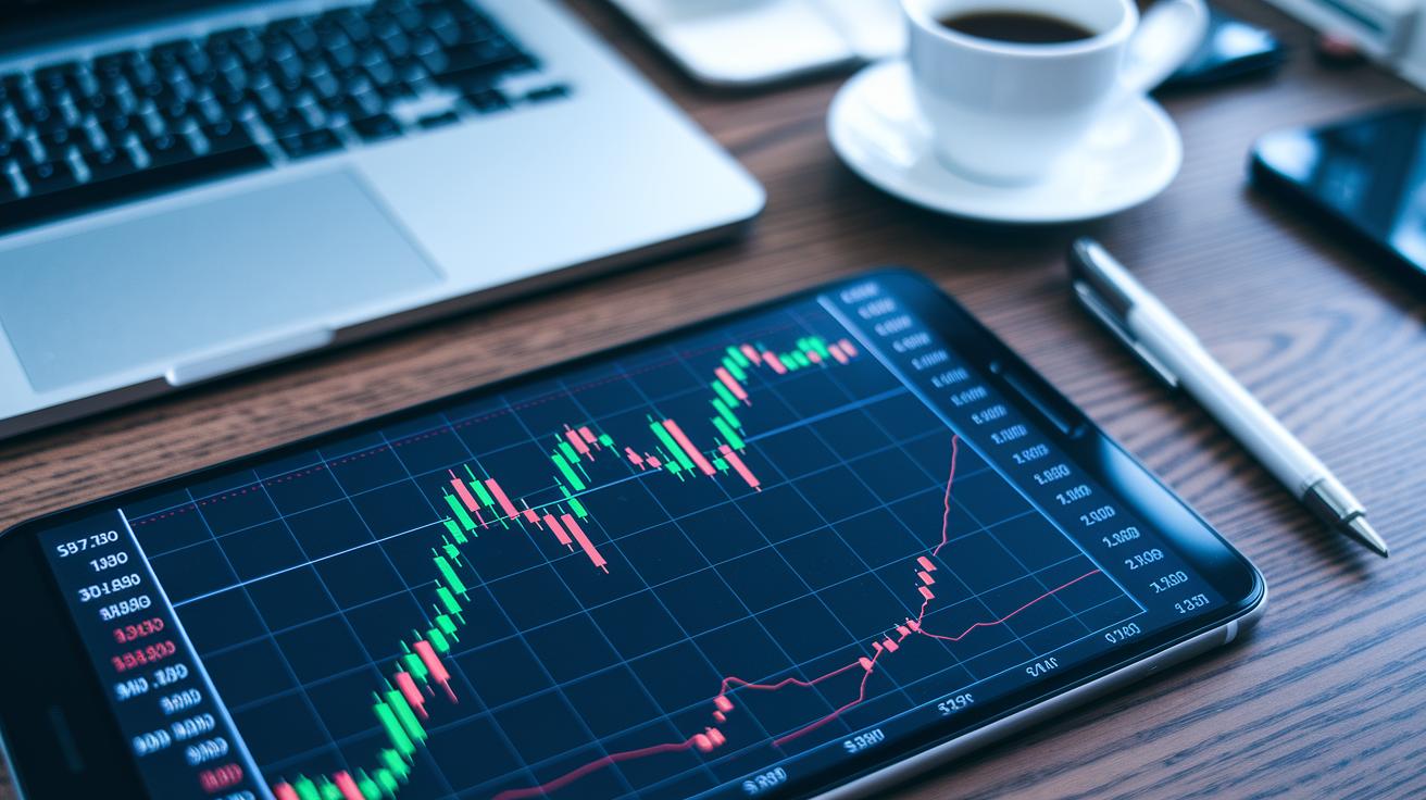
When you study charts, they work like a helpful guide that shows you signals for a potential price drop. Picture a snapshot of a major stock or currency pair where each candlestick tells a part of the story. It’s a bit like having a clear picture of when the market mood might change.
Think back to the old days when Japanese rice traders used similar ideas to get a quick feel for the market. Today, you can blend these visuals with key tools like volume spikes or moving averages to confirm your findings. It isn’t magic, it’s about using familiar, reliable techniques to spot when things might head south.
Here’s an easy-to-read table that breaks down each pattern. It shows you the best timeframe to watch, the signal you need, where to place your stop-loss, and what the target area is. You can tweak these settings whether you’re trading stocks, forex, commodities, or even cryptocurrencies.
| Pattern | Timeframe | Confirming Indicator | Typical Stop-Loss | Target Zone |
|---|---|---|---|---|
| Shooting Star | Daily | Volume Spike | Above Candle High | Next Support |
| Bearish Engulfing | 4-Hour | MACD Crossover | Above Recent High | Mid-Level Pivot |
| Evening Star | Daily | RSI Divergence | Above Pattern High | Significant Support |
| Dark Cloud Cover | Hourly | Moving Average Break | Above Prior High | Lower Trendline |
| Three Black Crows | Weekly | Volume Confirmation | Above Series High | Key Support Zone |
Using this table as your cheat sheet means you can adjust timeframes or swap indicators depending on your market. It gives you a fast visual reference that aligns with current conditions, making your trade ideas clearer and your decisions more confident. Have you ever felt that satisfying click when everything lines up just right? This blend of visual tactics and technical confirmation can be a real game changer for your trading strategy.
Common Mistakes and Risk Management When Using Bearish Candlestick Patterns

One frequent pitfall is acting on a bearish candle in isolation. Some traders spot the pattern and jump into a trade without checking the broader market scene. For instance, a bearish candle in a downtrend could be misleading if other key signals don't support it. This rash move can lead to overtrading and unnecessary losses.
Another common error is misreading the context. You might see a bearish pattern after an uptrend and sell immediately without waiting for more confirmation. If this pattern appears during a pullback or in a sideways market, it may not really mean a reversal is coming. This mistake can cause you to exit positions too early, cutting off potential gains.
A wise tip is to always set your stop-loss orders above the pattern's high or the nearest recent resistance. Adjust your position size so that only a small percentage of your capital is at risk on any trade. Using risk management tools, like those available at tools for financial risk management, can help fine-tune these settings. By taking a careful approach, you protect your funds and handle false signals better, keeping your trading strategy solid over time.
Final Words
In the action, we examined how bearish candlestick patterns serve as clear signals for shifting market sentiment. We walked through how single and multi-candle setups hint at potential price drops, while also highlighting ways to use these insights in smart trading strategies.
Risk management plays a key role throughout. Blending these visual cues with careful exit plans can boost your confidence when placing trades. Keep an eye on these patterns and use them wisely to remain alert and ready for new market moves.
FAQ
Where can I find PDF guides on candlestick patterns?
The query for PDF guides refers to downloadable resources like cheat sheets and comprehensive lists covering both bearish and bullish patterns. These guides provide visual examples and formation rules for quick market reference.
What is a bearish candlestick pattern?
A bearish candlestick pattern shows price behavior where sellers take control, indicating the potential for a price drop. It visually marks shifts from buyer to seller pressure in the market.
What is the strongest bearish pattern?
The strongest bearish pattern is often seen as the bearish engulfing formation. It occurs when a small bullish candle is completely overtaken by a larger bearish candle, highlighting strong selling pressure.
What is the 5 candle rule?
The five candle rule suggests waiting for five consecutive candles to confirm a trend reversal. It serves as a guideline for traders to gauge the momentum before acting on a potential downtrend.
Is bearish red or green?
Bearish candlestick patterns are generally depicted in red. This color choice indicates that the closing price is lower than the opening, signaling seller dominance in the market.
What are bullish candlestick patterns?
Bullish candlestick patterns represent market conditions where buyers are in control. They indicate potential upward moves and help traders identify entry points during an uptrend.
What does a bearish candlestick patterns chart show?
A bearish candlestick patterns chart visually displays various formations that suggest seller control. It offers a quick reference for spotting when market sentiment shifts toward potential price declines.