Have you ever thought that trading could be as simple as reading a map? Imagine turning confusing numbers into clear pictures that show you market trends.
Charts let you see when money is gathering strength or losing its spark, just like clear signs along a well-known route. This makes it easier to figure out when to buy or sell.
In this article, we’ll walk you through how to pick the right chart, notice the key trends, and set safety rules to protect your trades. It’s like having a friendly guide by your side as you navigate the market.
Get ready to see how clear charts can sharpen your skills and boost your confidence in trading.
Applying Charting and Technical Analysis to Trading
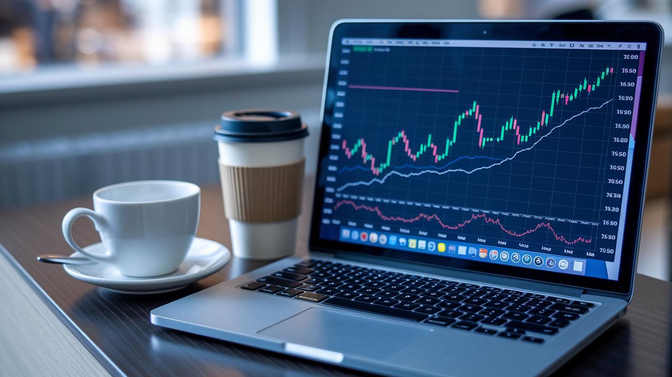
Charting is like drawing a map of money as it flows through the market. It turns messy numbers into pictures that help you see price trends and feel the market's mood.
Understanding the different stages of money flow, accumulation, participation, and distribution, is key. These stages act like signposts. They show you when the market is slowly gathering strength, in full swing, or getting rid of assets. This insight can guide you on when to jump in or step out of a trade.
- Selecting a chart type – Pick a chart that fits your style. For example, candlestick charts reveal the details of price action, almost like watching a story unfold.
- Identifying the trend – Look for patterns where prices move up, down, or sideways, similar to spotting the rhythmic rise and fall of ocean tides.
- Marking support and resistance – Draw simple lines where prices often bounce or pause. Think of it as setting boundaries or spots you know well, like a fence around a playground.
- Applying stop-loss – Set a rule to protect yourself from big losses if things turn south.
- Timing entry and exit – Choose the best moments to start or end your trade, much like catching the perfect wave when surfing.
Risk versus reward is at the heart of every trade. By using stop-loss rules along with clear support and resistance setup, and by picking your moments carefully, you can manage risks while still chasing good rewards.
Key Chart Types for Technical Analysis
Picking the right chart can really help you get a quick feel for the market. Each chart type shines a light on different parts of price movements. A line chart shows the overall trend by using closing prices, while a bar chart throws in more details like the opening, high, low, and close prices. Candlestick charts add color and style to the mix by highlighting patterns like Doji or Hammer, which can hint at the market's mood. And then there’s the Heikin-Ashi chart, which smooths out the data to help you see the main trend without as much fuss over small fluctuations.
| Chart Type | Data Displayed | Best Use |
|---|---|---|
| Line | Close prices over time | Simple trend visualization |
| Bar | Open, high, low, close | Highlighting price range variations |
| Candlestick | Price details with visual cues | Reading market sentiment and identifying reversals |
| Heikin-Ashi | Smoothed price movements | Clarifying trends by reducing volatility |
Time frames also play a big role. Shorter time frames can capture quick moves, while longer ones smooth out the ups and downs, giving you a steadier picture. For more insights on how time frames can change your view, check out this discussion on technical analysis using multiple timeframes.
Chart Patterns and Trend Identification Techniques
Chart patterns work a bit like fingerprints for the market, showing you hints about where prices could be headed next. When you look at these patterns, you can spot key areas where prices tend to hold or fall, and even catch new trends as they start. Each pattern offers its own little story about how buyers and sellers are feeling, helping guide you to make choices that feel a bit smarter.
- Head & Shoulders: This pattern looks like a big peak in the middle with two slightly lower ones on each side. It often points to a change in the trend.
- Double Top: Imagine prices reaching a high level two times in a row. That can signal strong resistance and the chance that prices might take a dip.
- Double Bottom: This is the opposite of a double top. Here, prices hit two lows in a row, creating a support level before a potential move upward.
- Triangle: Picture two trend lines coming together like they’re squeezing the price in. This usually means the market is pausing before breaking out.
- Flag: After a sharp move up or down, prices sometimes form a small rectangle, hinting at a short break before continuing in the same direction.
- Pennant: It’s quite similar to the flag, but the sides of the pattern slowly come together, suggesting a brief pause before the trend resumes.
- Wedge: In this case, prices consolidate in a slanted pattern that points to a future move in the same direction as the tilt.
- Cup and Handle: Think of a cup shape with a small dip on one side. This pattern often hints at a bullish move ahead.
Breakouts and reversals from these patterns send clear signals about where the market might be going. For example, if prices break above the top of a triangle or flip direction in a head and shoulders pattern, it’s a sign that the trend could be shifting. These visual clues help you decide when it might be the right time to jump into or get out of a trade, balancing the risk and reward by riding along with the market’s natural flow.
Applying Moving Averages, Oscillators, and Momentum Indicators

Indicators work like road signs in the market. They cut through the static and show you what's really happening with prices. They help you spot trends, notice when things might change, and decide the best time to jump in or step away. For more details, you might want to check out the technical analysis of the financial markets.
Simple and Exponential Moving Averages
Moving averages are like looking at a smoother photo of the market by averaging out price jumps over time. The simple moving average does this by calculating a basic average, while the exponential moving average focuses more on recent prices. When one moves above the other, it can be a gentle hint that the market trend is shifting, kind of like when a subtle change in the wind tells you a storm might be coming.
Relative Strength Index and Stochastic
These oscillators are your go-to tools for gauging market energy. They measure price strength on a scale from 0 to 100, helping you spot when the market might be overbought or oversold. It’s a bit like a speedometer that tells you if you’re pushing too hard or if it’s safe to speed up. And when the indicator and the price don’t match up, it might mean that a change in direction is about to happen.
MACD and Momentum Lines
The MACD tool combines a histogram with moving averages to track shifts in market momentum. When the signal line crosses over, it acts as an early whisper that momentum is either building or fading away. This little alert can help you fine-tune your decisions about when to get in or out of a trade.
Bollinger Bands and Donchian Channels
Bollinger Bands wrap around price data and adjust based on how volatile the market is, they widen when things get hectic and narrow when they calm down. Donchian Channels mark the highest and lowest prices over a certain period. Both give you clear visual clues about possible breakouts and help you assess risk versus reward, guiding you through the ups and downs with a bit more confidence.
Volume Study Techniques and Signal Confirmation Tactics
Volume is like the heartbeat of a market move. It confirms shifts in price and backs up the trends you see, giving you more confidence when you decide to trade.
Consider these tips:
- Volume spikes on breakouts – When volume suddenly increases, it usually means there's a strong move happening.
- Climax volume reversals – When the volume gets extremely high, it might be a sign that a trend is ending.
- Volume-price divergence – If price and volume move in opposite directions, watch out; a change could be on the way.
- On-balance volume trends – This approach adds up all the volume to show whether buyers or sellers are in control.
- Session volume profiles – Looking at volume in different trading sessions can reveal how the market behaves throughout the day.
Mixing volume data with candlestick signals gives you a clearer picture. For instance, if a candlestick shows a solid reversal pattern at the same time that volume jumps, it helps confirm the signal. This pairing makes it easier to pick your entry and exit points, balancing the risks with the possible rewards.
Advanced Charting Strategies: Retracements, Channels, and Cycles

Advanced charting tools give you that extra edge for deciding when to jump in. Instead of using only basic visuals, these strategies help you spot small shifts in the market so you can time your trades a bit better.
One key tool here is Fibonacci retracements. This method involves placing certain percentage levels on past highs and lows to mark where prices might slow down or even reverse. To put it simply, levels like 38.2% and 61.8% often act as signposts for support or resistance, think of them as checkpoints on your trading journey.
Next up, regression channel studies and directional channel frameworks work like drawing clear lines around price movements. They create visible boundaries that help you see the trend’s structure. With these in view, you can tell when a trend might pause or bounce back, making it easier to set targets and decide on exits in a disciplined way.
Then there’s periodicity analysis and cycle theory. These approaches break down the market into repeating phases. By mapping out these cycles, you can forecast when similar trends are likely to occur again. In essence, it’s like syncing your trading moves with the natural rhythm of the market.
Overall, using these advanced charting strategies helps you connect with the market’s pulse and trade with more clarity and confidence.
Charting Software and Interactive Indicator Platforms
When you choose a charting tool, you want something fast, reliable, and packed with useful features. Look for platforms that help you spot signals automatically, let you draw and interact with your charts, and allow you to check different timeframes easily. This way, you can stay on top of a fast-moving market.
- FinTech Pro shows you real-time signals with automated alerts and clear visuals. It’s like having a smart friend who keeps an eye on the market for you.
- TradeMaster brings interactive indicators and strong data visuals to your screen, perfect for a quick look at market trends.
- ChartGenius lets you track price changes across different timeframes with pinpoint accuracy, making it easier to catch shifts in trends.
- SignalSync mixes in software insights with a clean, user-friendly dashboard so you always know what’s happening.
- MarketView pairs innovative trading systems with advanced drawing tools, helping you decide when to enter or exit a trade confidently.
Using these tools every day can make a big difference. By checking out the automated alerts and interactive features, you can adjust your strategies quickly. It’s just like following a consistent routine that keeps your trades aligned with your risk and reward goals, so you can steadily move forward in the market.
Final Words
In the action, you saw how careful study of charts, visual market strategies, and risk–reward alignment can transform trades. Each section helped build a clear, step-by-step approach to charting and technical analysis, from using candlestick insights to well-timed entries and exits.
This practical guide reinforces the importance of combining clear price action signals with solid risk management practices. Positive momentum awaits those who keep learning and adapting. Happy trading!
FAQ
What is charting in technical analysis?
The definition of charting in technical analysis means using visuals to show market movements, helping traders spot trends, patterns, and shifts in price action for better trading decisions.
What are the two charts for technical analysis?
The explanation for the two charts in technical analysis points to line charts, which show overall trends, and candlestick charts, which detail price action and market sentiment.
What are the two types of technical analysis?
The description of the two types of technical analysis covers chart-based analysis, which relies on visuals, and indicator-based analysis, which uses mathematical tools to analyze price information.
Where can I find charting and technical analysis PDF resources?
The availability of charting and technical analysis PDF resources means you can download free guides, including works like the Fred McAllen PDF and trading masterclasses, from various online financial platforms.
How does TradingView relate to technical analysis?
The role of TradingView in technical analysis involves providing an interactive charting platform with diverse tools, including multiple chart types and indicators, to support detailed market study.