Ever wonder if one little candle could unlock the secret to smart trading? Candlestick analysis lays it all out by showing four key price points that let you see what’s really happening in the market.
This method goes way back to 18th-century Japan. Back then, traders used these simple charts to track rice prices, sort of like reading a tiny diary of market activity. Today, understanding these signals can help you figure out whether buyers or sellers are in control.
In this chat, we’ll explore how each candlestick can spark winning signals and boost your confidence when making decisions. Have you ever felt that rush of excitement when everything clicks? That might just be the market’s way of giving you a friendly nudge.
Fundamental Candlestick Study: Chart Components & Market Sentiment
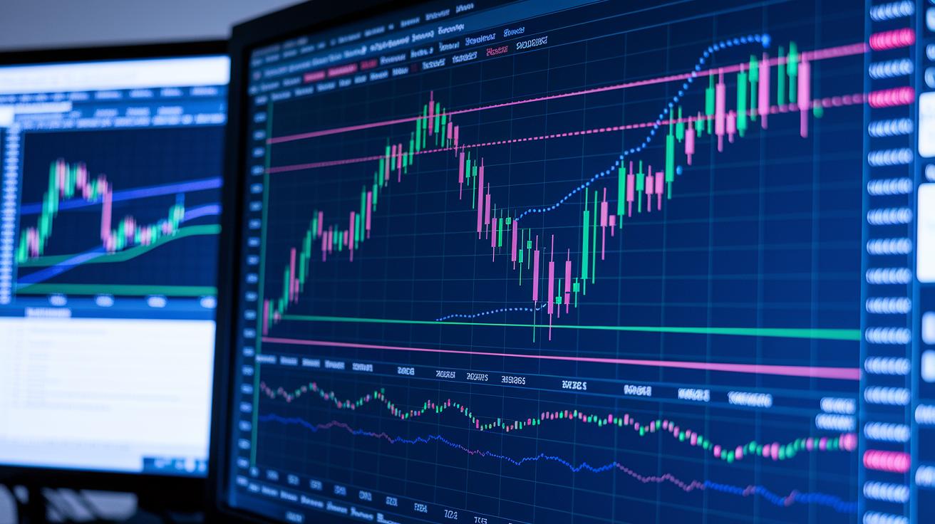
Candlestick analysis is like reading a mini story about what happened in the market during a specific period. Each candle shows four key numbers: the price at the beginning (open), the end (close), the highest point (high), and the lowest point (low). This method dates back to 18th-century Japan when traders first kept track of rice prices. Even today, it remains a go-to tool for understanding market mood.
Every single candle makes it clear what buyers and sellers were doing. A green candle usually means prices were on the rise, traders were feeling bullish. A red candle, on the other hand, signals that prices fell, hinting at a bearish outlook. And those thin lines above and below the candle body, often called wicks or shadows, show how far prices moved before settling down. For example, a long lower wick might mean buyers pushed prices up later, even if the session ended with a lower price; a long upper wick could show sellers holding strong near the top.
In simple terms, a candlestick is built using these four basic price points:
- Open
- High
- Low
- Close
This straightforward setup helps traders quickly see the battle between buyers and sellers, giving them a clear snapshot of market sentiment at a glance.
Recognizing Bullish & Bearish Candlestick Patterns
Bullish Candlestick Patterns
A hammer pattern shows up as a small candle body with a long lower wick at the end, usually after a downtrend. This tells us that buyers stepped in strong during the session and might be turning the tide. Imagine watching prices fall steadily, then suddenly a candle with a tiny body and a long bottom wick appears, it's a hint that buyers are starting to gain control.
The inverted hammer looks a lot like the hammer but has a long upper wick instead. Even though it sits at the bottom of a downtrend and might seem a bit fragile, it suggests that buyers are getting ready to push prices higher.
Bullish engulfing patterns are easy to spot: a big green candle completely covers the red candle before it. This tells us that the buyers have overpowered the sellers, and it’s a strong sign that prices may climb soon.
Morning star patterns use a trio of candles, a down candle, a small candle, and then a strong green candle. This three-step move tells us that the market might be switching from a downtrend to an uptrend as buyer energy takes over.
Three white soldiers are made up of three solid green candles in a row that keep closing higher. This pattern shows that buyers are steadily pushing prices up, especially after a period when things were looking low.
Bearish Candlestick Patterns
The shooting star appears at the top of an uptrend. It has a small body and a long upper wick, which means sellers may have come in at the high of the day to push prices down, a hint that things might soon reverse.
Hanging man patterns also have a small body and a long lower wick, but they show up after an uptrend. They warn us that, behind a seemingly strong session, selling pressure might be gathering.
Bearish engulfing patterns are the opposite of bullish ones: a big red candle completely covers the previous green candle. This strongly indicates that sellers now have the upper hand and prices might start falling.
Evening star patterns are set up in three steps, starting from an uptrend and ending with a solid red candle. This setup gives us an early warning that the market trend could soon turn downwards.
Three black crows are three red candles in a row, each closing lower than the last. Their appearance points to sustained selling pressure throughout the session.
Finally, the gravestone doji features a tiny body paired with a long upper wick. This formation tells us that sellers dominated the session, potentially pushing prices into a downtrend.
Continuation & Indecision Candlestick Formations
When you watch the market, you'll see patterns that suggest a trend will carry on after a short break. For instance, rising three methods show that even with a few smaller candles in between, the upward trend is still strong. Falling three methods work the same way but for a downtrend, hinting that the decline is set to continue after a brief pause. And then there's the cup-and-handle formation, which often points to a bullish breakout after the price has been moving sideways for a while.
Now, let’s chat about indecision patterns. Spinning tops are one good example. They have a small body with long wicks on both sides, meaning that neither buyers nor sellers were in full control during that session. It’s like the market is taking a breath, waiting for a clear signal. Doji patterns work similarly, where the opening price is nearly the same as the closing price. Picture a candle that looks almost like a little cross, this shows that traders are evenly matched, and the market is on the verge of picking a new direction.
And then there are tweezer tops and bottoms. These patterns compare two consecutive candles with matching highs or lows, suggesting that a short-term reversal might be on the way. Essentially, they remind traders to be patient and wait for a clearer sign before making a move.
Combining Candlestick Analysis with Technical Indicators

When you mix candlestick patterns with other technical tools, it helps you steer clear of false signals and spot the best setups. For example, many traders check candlestick patterns alongside RSI readings (which help you see if an asset might be overbought or oversold) to gain better insight. Think about it like this: if you spot a hammer pattern along with an RSI reading under 30, it can be a hint that a solid bounce back is on the horizon.
Tools that measure volume, like On-Balance Volume (OBV) or VWAP, add more confirmation to what you're seeing. So, if you notice a bullish engulfing pattern coupled with rising volume on OBV, it usually backs up the idea of a strong upward move.
Bollinger Bands throw another piece into the puzzle by showing you how wild the market might be behaving. For instance, if a candlestick points to a possible reversal and the price touches the lower band, that could be a clue for a rebound. Plus, layering moving averages and drawing trendlines helps cut out the extra noise; a method like the "three candle rule" can really boost your trend confirmation.
By blending these indicators with candlestick analysis, you get clearer clues about momentum, volume, and trends, which can lead to smarter, sharper decisions.
Risk Management & Signal Validation in Candlestick Analysis
Looking back at recent years, traders have noticed that certain candlestick patterns, like the engulfing, hammer, morning star, and evening star, tend to work moderately well. In simple terms, these patterns give you about a 55%–65% chance of spotting a short-term reversal. Many traders prefer daily charts because they help cut out the extra “noise” you might see on shorter time frames, making the signals easier to trust.
To boost the accuracy of your trades, there are a few key rules to follow. For one, it's important that the price bounces off a clear support or resistance level. Think of it like watching a ball hit a solid wall, it tends to rebound. Also, check that the pattern holds true on more than one time frame. For example, a bullish engulfing pattern might be even more dependable if it shows up near a well-established support zone on both a daily chart and a four-hour chart. It’s a bit like noticing that the water calms right where you expect the tide to turn.
Before you jump into a trade, setting your stop-loss order is a must. This means you place an order to sell if the price drops past a certain point, usually just outside the extremes of the pattern. Doing so helps keep your risk in check by ensuring that losses don’t spiral out of control.
Here are the basics to remember:
| Step | Description |
|---|---|
| Validate Signals | Use support or resistance levels to check if a pattern is trustworthy |
| Cross-Check Time Frames | Look at the pattern on both daily and shorter-term charts for consistency |
| Set Stop-Loss Orders | Place stops just beyond the pattern’s extremes to minimize risk |
This careful, step-by-step method not only helps you manage your risk but also builds your confidence with every trading decision you make. Have you ever felt the calm assurance of a trade where everything lines up just right? That’s the goal here.
Applying Candlestick Analysis in Intraday & Swing Trades

If you’re trading within the day, you might try the 5-Min Candle Strategy. This method uses tiny, minute-based candles to show you quick entry and exit points. Picture a candle that lights up each rapid price change, it helps you navigate busy, volatile moments where every second counts.
Swing traders, however, often look at daily and 4-hour candles. These longer timeframes filter out the small, distracting movements so you see clearer trends over several days. For example, if you notice a bullish engulfing pattern along with supportive RSI levels on a daily chart, it could hint at a strong move ahead. I remember one trade on the S&P 500 that gave a 150-point gain, which really highlighted the power of this approach.
Forex traders aren’t left out either. An hourly chart showing a doji pattern on the EUR/USD pair can signal that the market is on the fence. This shows a balance where buyers and sellers are uncertain, so it tells you to set your stop-loss and target orders with care.
Key methods to keep in mind:
- 5-Min Candle Strategy for quick entries in intraday trading
- Daily and 4-hour candle setups to spot swing trade reversals
- Watching for doji patterns in forex charts to manage risk effectively
These techniques blend clear technical chart methods with live market feelings, turning candlestick patterns into practical signals that can really boost your trading insights.
Final Words
In the action, we broke down how candlesticks show market sentiment with clear open, high, low, and close data. We looked at bullish and bearish patterns, explored continuation signals, and saw how to blend these insights with tools like RSI and volume indicators. We also talked about managing risk with smart stop-loss strategies and signal validation. All these tips build a strong foundation for reliable trades. Happy trading with candlestick analysis, keep refining your approach and stay positive.
FAQ
What is a recommended candlestick analysis book or resource?
A candlestick analysis book explains how to read open, high, low, and close price points, offering practical examples of bullish and bearish patterns that help traders spot clear market signals.
Where can I find candlestick analysis PDFs or downloads?
Candlestick analysis PDFs and downloads provide ready-to-use guides on patterns and chart reading. They offer clear explanations suited for both beginners and experienced traders to refine their strategies.
What is a candlestick chart?
A candlestick chart depicts price action by showing the open, high, low, and close points. It uses colored bodies to signal buyer or seller control.
- Open
- High
- Low
- Close
What are bullish and bearish candlestick patterns and how can beginners recognize them?
Bullish patterns, like hammers or engulfing signals, suggest market reversals upward, while bearish ones, such as shooting stars, hint at declines. These clear visuals help beginners interpret price action.
How do I analyse a candlestick?
Analysing a candlestick involves checking its body, wicks, and color to evaluate open, high, low, and close prices. This review helps reveal underlying buyer or seller pressure in the market.
What is the 3 candle rule?
The 3 candle rule assesses three consecutive candles to confirm a trend change. This approach helps traders decide if a move is starting or ending by observing how each candle behaves.
What is the most reliable candlestick pattern?
The most reliable candlestick pattern isn’t set in stone; many traders trust patterns like the bullish engulfing and hammer for their strong reversal signals, yet they always use confirmation tools before trading.
What is the 5 candle rule?
The 5 candle rule reviews a series of five consecutive candlesticks for a broader view of trend momentum. This method provides extra validation to ensure the trend is consistent over a slightly longer period.
Where can I find candlestick resources online?
A candlestick website offers a collection of tools, guides, and articles that help explain chart components and pattern signals, making it a great starting point for both beginners and advanced traders.