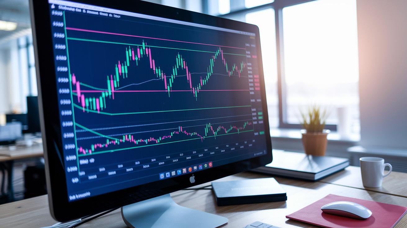
Ever notice how a simple chart can capture the flow of the market? Candlestick charts take the day’s trading and break it down into four key numbers: the opening, closing, highest, and lowest prices. This turns basic figures into a clear picture that shows if a trend is building strength or losing its spark.
In this article, we'll chat about how to read these charts so you can follow market trends more easily. It’s pretty amazing how just a few numbers can reveal so much about what the market is doing.
Candlestick Chart Anatomy: Understanding the Body, Wicks, and Data Points
Candlestick charts give you an easy snapshot of market prices using four key numbers: open, high, low, and close. Think of these as the building blocks of every candlestick.
The open is like the starting line of a race, and the close is its finish line. Meanwhile, the high and low show you how far prices reached during that time, almost like tracking the farthest steps taken in a sprint.
The colored block in the middle, called the body, tells you if the prices ended up higher or lower. When you see a green or white body, it means prices finished above where they started, a clear sign of a bullish move. The thin lines extending from the body are known as wicks or shadows. They mark the highest and lowest points, just as if you were drawing a peak and a valley around the day's activity. Sometimes, for example, you might notice there’s no upper wick; this tells you that one of the price points already captured the very top for that period.
Next time you look at a candlestick chart, try to see it as a mini story of the market’s race, a friendly reminder of how even a few numbers can paint a picture of financial movement.
Common Bullish and Bearish Patterns in Candlestick Chart Analysis
When you spot a Hammer or an Inverted Hammer near the end of a downtrend, it usually means buyers are gaining strength. These candles show a short body with a long lower tail, hinting that sellers might be starting to lose grip as prices get ready to recover.
Another clear sign is the Engulfing pattern. Here, a small bearish candle is quickly covered up by a larger bullish one. It’s a bit like stepping into a shift where the market slowly moves power from sellers to buyers, an encouraging signal for many traders.
Then there are the Three White Soldiers. This pattern features three bullish candles in a row, each closing a bit higher than the last. This steady climb often tells traders that buying pressure is alive and well, and it could be a good moment to consider entering the market.
On the other side, watch out for the Three Black Crows. Seeing three big bearish candles in a row is a strong reminder that sellers might be steering the market. Similarly, the Dark Cloud Cover appears when a bearish candle opens above the previous high but then falls down to close below its midpoint, suggesting that the bullish energy is fading.
Also, keep an eye on the Shooting Star and Hanging Man. These patterns often appear at the top of a market move, showing a small candle body with a long upper tail. They hint that the rally might be slowing, and a reversal could be in the works, useful clues if you’re thinking about stepping out of a trade.
Charting in Technical Analysis – https://clientim.com?p=1970
Candlestick Chart Trends and Market Sentiment Analysis
Trend analysis is really about noticing how a market moves over time, like watching a series of highs and lows. When you see each peak and valley shifting steadily in one direction, it tells you the trend is clear. For instance, if the tops keep dropping, it's a sign that the market is going down. On the flip side, rising bottoms mean the market is climbing. Think of it like stepping up a staircase, each step confirms the path you're on.
The look of the candles, their color and size, gives you clues about market mood. A bunch of red candles on a daily chart tells us that sellers are in charge and the market might be slowing or declining. Meanwhile, green candles show that buyers are active, pushing prices higher. Imagine a line of green candles like a rising tide lifting all boats, making it easy to see bullish momentum.
People often choose daily charts because they cut out the short-term noise you might see in minute or hourly charts. This gives you an almost X-ray view of trader feelings, revealing clear shifts in buying and selling pressure. Picking the right timeframe is like adjusting your glasses, it helps you spot the real trend with clarity.
Candlestick Chart Strategies: Using Candle Trends in Trading

Traders mix candlestick patterns with tools like volume and RSI (a measure of how fast prices change) to guide their moves. When you spot a candlestick pattern, it’s like noticing a hint, and the extra tools help fill in the picture. Imagine you see a Bullish Engulfing pattern with a rising RSI, showing that buyers have stepped in. It’s much like checking your map before a long drive to make sure you’re on the right track.
Risk management is key in trading, and using candle patterns is no different. Setting up a clear stop-loss, essentially a safety net, keeps your losses in check. Picture pairing a Bullish Engulfing signal with a strong stop-loss and proper position size. This setup is like having a seatbelt; it protects you from sudden market twists while letting you enjoy the ride when things go well.
Before you jump into live trading, test your candle strategy using old market data. Practicing with historical trends gives you a feel for how reliable your pattern might be. And by using extra tools like moving averages (which show average prices over time) or oscillators (which help spot shifts in momentum), you can cut down on false alarms. Think of it as having a few extra friends look over your shoulder during a tough market day.
Advanced Candlestick Chart Techniques for Informed Trading Decisions
Research tells us that mixing candlestick patterns with simple prediction tools can really boost our market forecasts. Experts point out that using patterns like the Engulfing, Hammer, and Shooting Star can clear up market signals. In plain terms, combining these trusted patterns with smart analytics means traders can predict price movements with a sharper edge.
Many seasoned traders watch for the Doji because it shows a balance between buyers and sellers. Think of it like a subtle hint that the market might change direction soon. Studies support that these patterns help take the guesswork out of trading strategies, making decision-making easier.
When you switch to daily charts, you cut through all the extra noise you see in minute-by-minute views. For day traders, having stricter filters makes sure those short-term ups and downs don’t lead to mistakes. Nowadays, algorithmic scanners that spot these patterns automatically are a game changer. They work hand-in-hand with smart analytics, like Predictive Financial Analytics, to confirm the patterns. This powerful duo gives traders a reliable tool for making well-informed choices.
Final Words
In the action, we broke down candlestick charts by showing how bodies, wicks, and key data points tell the market's story. We explored bullish signals like hammers and white soldiers alongside bearish cues, and we learned how trends and sentiment drive trading decisions. We also covered strategies that combine indicators with risk management to fortify your trades. With candlestick chart explained through clear examples, you can confidently use these insights to shape smart, secure decisions in your trading moves.
FAQ
Candlestick patterns PDF
The candlestick patterns PDF is a handy guide that outlines various candle formations, helping traders spot market shifts through simple, visual cues.
Candlestick chart explained for beginners
The candlestick chart explained for beginners shows market moves using a colored body and wicks that represent open, high, low, and close price points.
35 powerful candlestick patterns PDF
The 35 powerful candlestick patterns PDF offers a concise resource that presents key signal patterns, giving traders quick, clear insights into market behavior.
Candlestick chart (live)
The live candlestick chart displays real-time market price updates through dynamic candles, letting traders see immediate trends and price actions.
How to read candlestick chart for day trading
The method to read a candlestick chart for day trading involves checking the open, high, low, and close values on each candle to help guide rapid trading decisions.
Types of candlesticks and their meaning
The types of candlesticks and their meaning refer to different candle shapes and colors that show whether buyers or sellers control the market.
Bullish candlestick patterns
The bullish candlestick patterns indicate potential upward moves, featuring candles like the Hammer, Engulfing, and Three White Soldiers to signal buying strength.
All 75 candlestick patterns PDF
The all 75 candlestick patterns PDF is a comprehensive document that details a wide range of candle forms, offering insights into nuanced market signals.
How do you read a candlestick trading chart?
The approach to reading a candlestick trading chart includes examining the open, high, low, and close points along with the candle’s body and shadows to gauge market sentiment.
What is the 5 candle rule?
The 5 candle rule means observing five consecutive candles to confirm a trend before making a trading decision, adding an extra layer of confidence.
What is the most successful candlestick pattern?
The most successful candlestick pattern is often seen as the Engulfing pattern because it clearly marks a potential reversal when confirmed with other data.
How to read a candle for beginners?
The way to read a candle for beginners is to look at its open, close, high, and low values along with its color and shadows to understand whether the market is leaning toward buyers or sellers.