Ever wondered how plain numbers can tell a story? Quantitative descriptive analysis turns every taste and texture into easy numbers you can understand. Picture rating chocolates on a simple scale, where each number reveals a bit of the flavor puzzle.
This approach turns everyday tasting into solid data you can trust and compare. In this post, we'll dive into how basic numbers show the real quality behind products and why that matters for real-life experiences.
Foundations of Quantitative Descriptive Analysis
Descriptive statistics help us turn raw numbers into a clear picture. They work by grouping values into counts, think of a simple table listing how many times each flavor appears, and by calculating averages (like the mean, median, or mode) and spreads (such as range or standard deviation). It’s a bit like checking off items on a list to see which ones show up most.
Quantitative descriptive analysis, or QDA, uses these easy-to-understand methods during sensory tests. In QDA, trained panelists use straightforward numeric scales to rate things like flavor, texture, and appearance. Imagine tasting different batches of chocolate and rating the bitterness on a scale from 0 to 15. Those numbers give you real data to crunch.
This method is powerful because it turns personal tasting experiences into solid numbers you can compare over time or between products. Even with just a little training, panelists can summarize what they observe using these simple stats. It really shows you the quality of a product in a clear, measurable way.
For example, by charting how often specific taste notes appear, a company can quickly see which flavors dominate its product profiles.
Quantitative Descriptive Analysis: Key Statistical Tools and Measures
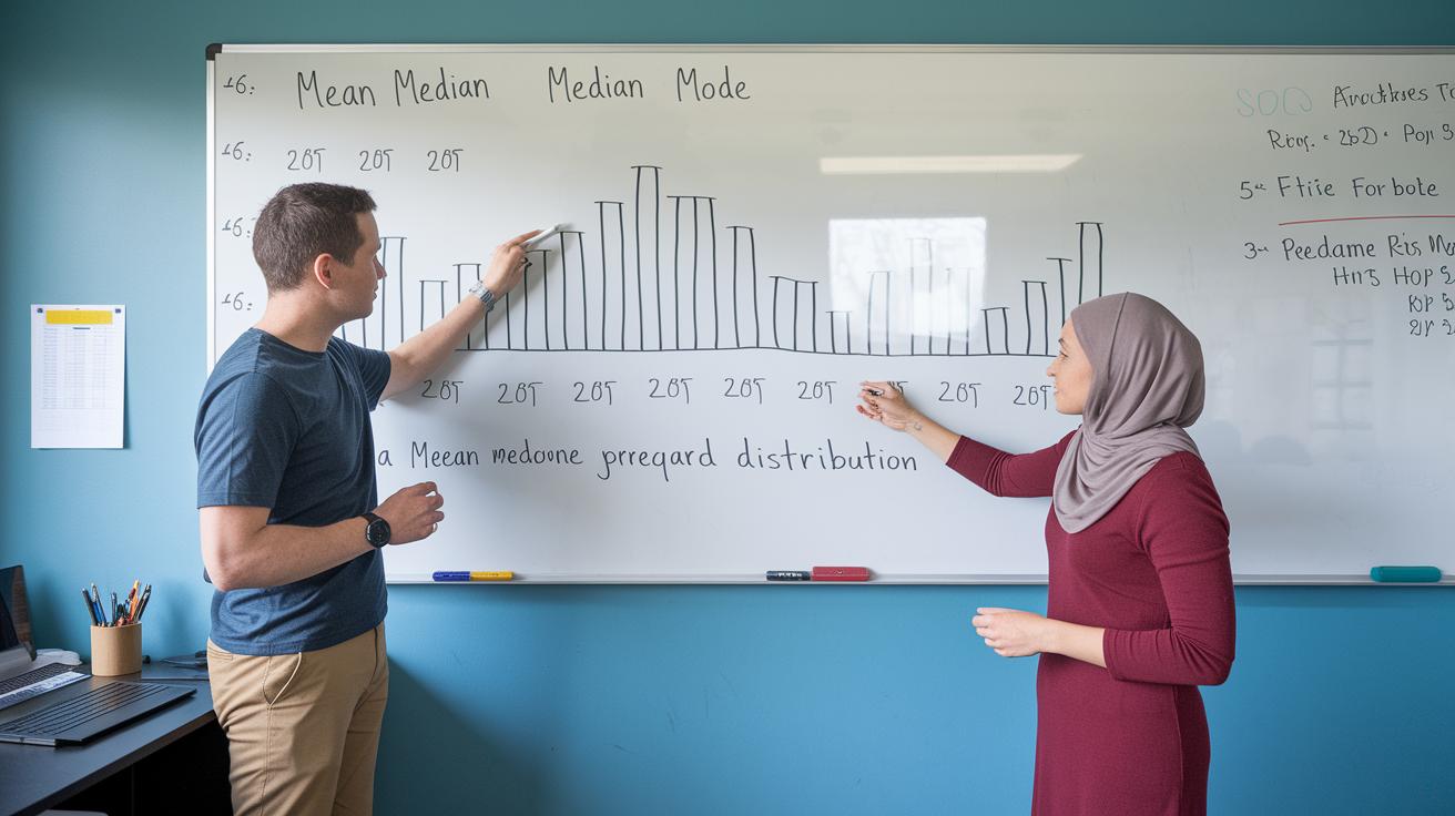
At its core, quantitative descriptive analysis uses numbers to show us what is happening in a dataset. One handy tool is the frequency distribution. This simply counts how many times each value appears. Think of it like counting how often a certain flavor rating shows up during taste tests.
Next, let’s talk about measures of central tendency. These include the mean (the average), the median (the middle value), and the mode (the most common value). They give you a quick look at the overall trend. For instance, if chocolate has a mean sweetness rating of 7, the median might be lower if a few very high ratings pushed the average up.
The range is another important measure. You get it by subtracting the smallest rating from the highest. This tells you how spread out your data is. Then there’s standard deviation, which shows how much each rating usually strays from the mean. In plain language, it points out whether the ratings are close together or vary a lot. Variance does something similar but puts extra emphasis on larger differences.
Using several of these measures gives us a full picture of the data so we don’t miss any details. Below is an HTML table that sums up these metrics:
| Measure | What It Represents | Calculation Example |
|---|---|---|
| Frequency | Counts of occurrences | How often a rating of 10 shows up |
| Range | How spread out the data is | Highest rating minus lowest rating |
| Standard Deviation | Average gap from the mean | Average distance from the mean |
By combining these techniques, we get a clear, detailed picture of the numbers. This makes it easier to make smart decisions based on the data.
Quantitative Descriptive Analysis: Clear Numeric Brilliance
Did you know that even someone with less than 10 hours of training can produce data so variable that you might need extra replications or a larger panel to get reliable results? It’s a surprising fact that reminds us how crucial a solid plan is right from the start.
Begin by laying down a clear foundation. Identify the type of data you plan to collect. Think of it this way: you might be dealing with nominal data (simple categories like red or blue), ordinal data (items in a ranked order), interval data (differences you can measure even if there’s no true zero), or ratio data (where zero really means nothing is there). This choice will guide your next steps and ensure everything makes sense.
Next, set up your study with a careful sampling process. Choose panelists who truly reflect the audience you’re targeting. Use a systematic approach so that your samples consistently represent the range of products or ideas you’re studying. And remember, planning for repeated measures can help balance out any extra variability that comes from shorter training periods.
High-quality data is key. Make sure you clean your data by removing any outliers or errors. If some entries are missing, decide whether to exclude them or estimate the missing pieces. For example, if a flavor intensity score seems unusually high or low, it’s smart to double-check it against what you normally expect.
Then, check your data’s reliability with repeat tests. Look at your results from multiple sessions to see if they consistently capture the same details. If there are big variations, you might need to adjust by increasing the panel size or doing more replications. This way, you can be sure your measurements truly reflect the intended attributes.
Finally, document every choice you make, from how you select and train your panelists to your sampling methods and data corrections. Keeping clear records not only supports the trustworthiness of your results but also makes the entire process more credible and transparent.
Quantitative Descriptive Analysis: Clear Numeric Brilliance

QDA uses clear, exact numbers to measure different qualities in a product. For example, a panelist might rate a product’s crunch at 8.2 on a scale from 0 to 15. This scale even includes tenths, giving us 151 possible distinct points to notice small details. Even a small change, like juiciness moving from 8.7 to 8.8, can signal a key quality shift.
When every sensory element is scored, the overall picture becomes much clearer. Instead of just knowing if a product is liked or not, you get a full numerical profile that digs deeper into every aspect.
Here’s an interesting tidbit: While standard tests might only tell you if a product is popular, QDA shows you that its smooth texture scores a striking 9.3, setting it apart from the competition.
| Attribute | Score |
|---|---|
| Crispness | 8.2 |
| Juiciness | 8.8 |
| Smooth Texture | 9.3 |
Case Studies: Quantitative Descriptive Analysis in Practice
Imagine a study that spends 100 hours training each panelist on every sense. They check each panelist’s work two to three times a year. With this much practice, one test session is all they need. In fact, a panelist who has trained over 100 hours can deliver nearly perfect data the very first time, cutting down the need for extra tests.
On the other hand, many QDA studies give panelists less than 10 hours of training. Because of the lighter training, these studies must use more panelists or run extra test sessions to get dependable results. Picture a team that has to repeat tests several times just to capture small differences in a product’s crunch or juiciness. This shows that more training can mean fewer sessions are needed.
| Method | Panelist Training Hours | Replication Requirements |
|---|---|---|
| Spectrum | 100 hours per modality | Single replication |
| QDA | Less than 10 hours | Multiple replications or larger panel |
These real-life numbers show the differences clearly. Looking at the results, heavy training leads to data that is both precise and easy to repeat. This case study proves that even small changes in training or test sessions can really affect the quality of sensory evaluation data.
Software Tools and Best Practices for Quantitative Descriptive Analysis

Tools like SPSS and Excel are key in turning raw data into clear, trustworthy numbers. They let you quickly generate frequency counts, calculate basic statistics like mean, median, and mode, and measure data spread with range, standard deviation, and variance. Imagine typing in your sensory scores into Excel and immediately spotting which numbers pop up most often. It really brings your data to life.
When displaying data, using several summary measures gives you a fuller picture. It’s a smart move to clean your data often, look out for odd entries or missing values that could throw your results off. Think of it like checking your gear before a big day out; every little detail matters.
Try these simple steps:
- Use multiple summary measures for a balanced view.
- Clean your data regularly to get rid of outliers and plug gaps.
- Document every step of your data process so you can easily follow your work later.
Stick to these practices, and you’ll have a solid, clear path from raw sensory scores to results you can trust.
Quantitative Descriptive Analysis: Univariate and Bivariate Approaches
Univariate analysis looks at one piece of data at a time. It’s like checking the average flavor score of a dish to see its usual taste. Imagine noticing that a simple mean score reveals a flavor intensity that even caught experts off guard. By counting how often certain scores appear or noting the range of values, you get a quick snapshot of what’s happening.
Bivariate analysis, on the other hand, compares two pieces of information to see if they’re linked. For example, you might notice that when texture scores go up, flavor intensity shifts too, suggesting a relationship worth digging into. This method often uses tools like scatter plots or simple tables to show how two factors move in tandem.
Both methods play key roles in understanding your data. Univariate techniques give you a clear picture of single data points, while bivariate strategies help highlight connections that can lead to deeper insights.
- Univariate analysis examines one variable at a time.
- Bivariate analysis investigates the relationship between two variables.
Together, these approaches lay the groundwork for more complex models by pointing out where the most interesting patterns appear.
Final Words
In the action, we broke down how quantitative descriptive analysis transforms numbers into clear, real-world insights. We covered basic statistical measures like mean, range, and standard deviation while exploring step-by-step methods from panel training to effective software use. Our discussion highlighted real-life case studies and ways to compare univariate and bivariate approaches. Every section helps build a solid foundation for smart data handling, risk management, and secure practices. Keep this straightforward approach in mind as you make more informed, confident moves.
FAQ
What is quantitative descriptive analysis and how is it applied?
The quantitative descriptive analysis (QDA) summarizes numerical data using measures like mean and range, and it’s applied in sensory evaluation by having trained panelists rate attributes such as flavor and texture.
What is a descriptive analysis in quantitative research and can you provide an example?
A descriptive analysis in quantitative research uses statistical measures to summarize data distributions. For example, calculating the mean and standard deviation of survey responses offers clear insights into the data’s behavior.
What is qualitative descriptive analysis?
The qualitative descriptive analysis focuses on detailing non-numeric responses. It records observations and participant comments to capture detailed, contextual information without assigning numerical scores.
What is Spectrum descriptive analysis in sensory evaluation?
Spectrum descriptive analysis is a sensory method where extensively trained panelists rate specific attributes using a fine-scale system, resulting in detailed profiles of product characteristics through precise scoring.
Where can I find PDF resources and journals on quantitative descriptive and sensory evaluation analysis?
PDF resources and journals on quantitative descriptive analysis are available via academic databases and online libraries hosting research studies and methodological guides, providing in-depth insights into statistical and sensory evaluation practices.