Have you ever wondered if a simple chart could change the way you invest? Technical analysis charts help you see market moves by pointing out trends you might miss otherwise. Whether you’re looking at the clear signals of candlestick patterns or the steady lines of line charts, each one shows you how prices are moving. In this post, we break down the most important chart types and show you why they are key to spotting opportunities that can change your trading game.
Key Types of Technical Analysis Charts and How to Read Them
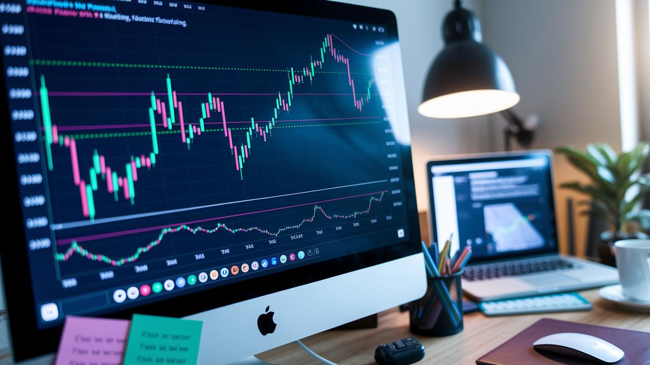
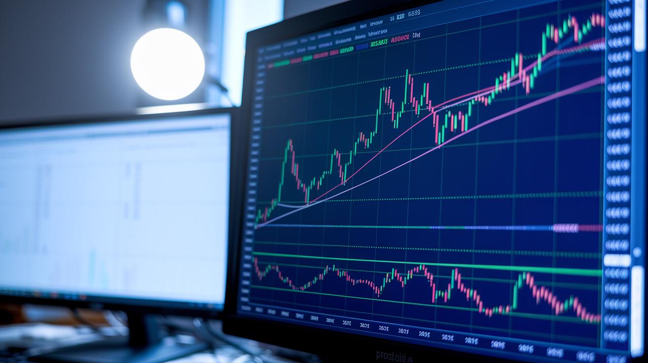
Technical analysis is all about looking back at past price and volume data to get a feel for the market’s rhythm. One important way to see this data is by using candlestick, bar, and line charts. Candlestick charts show the open, high, low, and close for each period. They’re great for spotting patterns. For example, you might see a big candle following a smaller one, a sign that the price could be moving up. You can learn more about this in our guide: what is financial analysis.
Bar charts tell a slightly different story. They use vertical lines to show the price range and little horizontal ticks to point out the open and close. This gives you a neat snapshot of how wild or calm prices are during each period. A trader might say, “I use bar charts to quickly figure out how much prices wiggle around in a session,” which helps bring this method to life.
Line charts, on the other hand, take a smoother approach. They connect closing prices over time, painting a clear picture of the trend. Since they don’t include all the extra details from within each period, you get a cleaner look at the market’s direction. Think of it like drawing a line through key moments, which can hint at steady buying pressure.
Beyond these common charts, there are plenty of technical tools and platforms to help sharpen your market view. For deeper insights and more options, check out charting in technical analysis.
Each chart type gives you its own way to see what prices are doing, be it the shaded body of a candlestick, the detailed ticks of a bar chart, or the smooth line of closing prices. Have you ever noticed how a single chart can change your whole approach to investing?
Technical Analysis Charts: Spark Smart Growth
Support levels work like safety nets. They give buyers a chance to step in when prices drop, and you can see prices bounce back up from these floors. For example, if a stock repeatedly bounces off $50, it shows that buyers are ready and waiting.
Trendlines are a neat way to understand price actions. When you connect two or more important low points in an uptrend, or high points in a downtrend, you get a clear picture of how strong the market is moving. Try drawing a line on a candlestick chart; it really helps you see the trend in action.
When you spot the same support or resistance level being tested three times or more, it tends to be more dependable. Prices bouncing off or stalling at these levels tell you a lot about how traders feel, whether they’re ready for a bounce or gearing up for a dip.
Chart Patterns for Trend Recognition and Reversal Signals
Think of chart patterns like footprints on a sandy beach, small clues left behind by market forces. They help you see when the market might switch direction or take a little break before moving on.
One common pattern is called head and shoulders. Picture three peaks with the middle one standing taller than the ones on each side, much like a mountain range with a dominant peak. When you spot this pattern, it might mean that the market, which has been going up, could be ready to turn down.
Other patterns, like double tops and double bottoms, also signal possible reversals. A double top forms an "M," suggesting that the pressure to buy might be fading. In contrast, a double bottom looks like an upside-down "M," hinting that sellers might be losing steam. These simple shapes can really help you plan your next move.
There are also patterns that signal a pause rather than a full turnaround. For example, an ascending triangle shows an upward sloping line, hinting that the price might break even higher after a short rest. Symmetrical triangles and flags work in a similar way by suggesting that the current trend is likely to continue after a brief pause.
A neat trick that many traders use is called a measured move. Here, you measure the size of the pattern’s base and then add that same distance from the point where the price breaks out. Imagine drawing a line upward from the breakout point to spot where the price might head next.
It also helps to add volume into your analysis. For instance, if you see a contracting triangle labeled A, B, C, D, and E that breaks above its upper trendline, it’s a strong sign that prices could move higher.
- Recognize key reversal patterns
- Note continuation formations
- Apply measured moves for targets
By combining what you learn from these patterns with clues from volume changes, you can feel more confident about your trading decisions.
Integrating Technical Indicators with Charts: Moving Averages, Oscillators, and Volume
Moving averages help smooth out the bumps in price data so you can easily spot the market’s overall trend. Picture the 50-day and 200-day averages like simple filters that clear away the daily noise. When the 50-day average crosses above the 200-day average, a setup we call a golden cross, it often suggests that the market might be turning more upbeat. Conversely, if the 50-day falls below the 200-day, known as a death cross, it could be a hint to be cautious. One trader even shared, “The golden cross gave me the confidence to strengthen my position.” It’s neat how these averages work hand in hand with clear chart patterns.
Oscillators and momentum indicators add a further layer of insight by flagging when prices may be too high or too low. They act like an extra check, especially when the price action isn’t giving a clear signal. For instance, if you see a quick price spike while an oscillator shows that the market might be overbought, it might be wise to wait for a bit more proof before diving in. These tools come together to turn a simple chart into a little story about market energy and momentum.
Volume analysis completes the picture. When trading volume jumps during a breakout, it backs up that move. But if volume stays low during an important shift, it might be a false alarm. By keeping an eye on volume trends, you add another layer of confidence to what the moving averages and oscillators are telling you. In truth, blending these three techniques gives you a fuller view of market activity and helps you figure out which signals are worth following for your next move.
Advanced Chart Techniques: Fibonacci Retracement and Elliott Wave Principles
Have you ever noticed how traders seem to spot just the right moment to dive into the market? Fibonacci retracements use important ratios like 23.6%, 38.2%, 50%, and 61.8% to show where prices might bounce back. Imagine a price drop that slows down near the 61.8% level, it could be a signal to take action.
Then there are Fibonacci extensions and 3-point extensions. These take the idea one step further by predicting profit targets beyond what most expect, like the 1.618 extension that traders trust as a sign of strong market moves.
Elliott Wave Theory adds another layer to this picture. It splits market movements into eight waves, five that drive the trend forward and three that help adjust the price. Think of each wave as a chapter in a story, each showing shifts in how traders feel. For example, a common pattern is a 5-wave drop that ends near the 1.618 extension (around 59.1%), which often marks a turning point in the market.
Traders mix these methods to sharpen their strategies. Using Fibonacci retracements together with Elliott Wave counts gives a clear way to spot where prices might find support or meet resistance, making it easier to set targets and adjust positions as the market changes.
Here’s a quick rundown:
- Use Fibonacci ratios to find key support levels.
- Apply extensions to see how far prices might climb.
- Count Elliott Waves to get a feel for the overall market mood.
By combining these techniques, you get a handy toolkit for smart growth no matter where the market goes.
Choosing the Right Charting Platform for Technical Analysis

Finding the best charting software really means choosing one that suits your style and meets your needs. Many traders trust TradingView because it offers advanced charts, an extensive library of community-created scripts, and real-time alerts. One trader mentioned, "TradingView gives me the flexibility to adjust every little detail on my charts, which makes even complex data feel easy to understand."
Another popular choice is MetaTrader 4 (MT4). It’s known for its reliable performance and features like open-order indicators and options for premium upgrades. Some traders prefer MT4’s more traditional layout because it feels straightforward during hands-on analysis. A user shared, "MT4’s simple design and powerful tools make it a daily essential for me."
Both desktop and mobile platforms have their own perks. Desktop versions tend to offer more ways to customize, faster speeds, and richer data feeds. On the other hand, mobile apps let you analyze markets on the go, keeping you connected wherever you are. Plus, features like VPS integration help automate your strategies when the market moves quickly.
Consider this: a seasoned trader once switched to a detailed charting platform and doubled his understanding of market signals.
Here are a few things to think about:
| What to Compare | Why It Matters |
|---|---|
| Customizable Chart Types | Makes it easy to tailor charts to your strategy |
| Real-Time Data Feeds | Keeps you updated with the latest market movements |
| Indicator Libraries | Helps you analyze trends with precision |
When you look at these options, remember that the right platform can boost how you read market signals by giving you clear, actionable visuals. Have you ever noticed how a good tool can make a big difference in your trading day?
Applying Technical Analysis Charts in Forex and Crypto Markets
Chart analysis isn’t a one-size-fits-all tool; it moves with the pulse of each market. When traders look at both major and minor forex pairs, they tune in to every tick on the screen. They follow spreads, margin, pricing, and even financing fees to get a clear picture of market conditions. For instance, one trader might say, "I keep an eye on a live USD/CAD chart during a central bank meeting to catch a burst of volatility." This shows how even short-term, intraday movements can offer big clues.
In forex, fast-changing economic news can trigger sudden surges or dips. Charts help traders spot these moves quickly so they can adjust their positions in time. They reveal moments when a currency pair’s price changes because of new policy updates or economic reports, giving traders a chance to tweak their strategies.
Crypto markets work a bit differently since they run 24/7. Here, chart analysis has to cover non-stop activity and sharper ups and downs. Imagine tracking Bitcoin through a day where each minute could bring a spike or a drop. Traders watch for clear markers, like round numbers that many believe will prompt reactions. These clues help them decide when to jump in or step back, even when unexpected news about regulations pops up.
Here's a quick checklist for traders:
| Focus Area | What to Watch |
|---|---|
| Forex Trading | Spreads, margin, and pricing shifts |
| Intraday Patterns | Reactions during central bank events |
| Crypto Markets | Key chart levels for rapid moves |
These flexible charting techniques let traders interpret live market scenes and adjust their strategies as things change.
Pattern Recognition Automation: Screener Tools and Algorithmic Detection on Charts

Imagine a tool that scans your charts in real time, spotting familiar shapes like head and shoulders, triangles, or channels. These platforms, like the Autochartist scanners, quickly note patterns using smart algorithms. A trader might even get a pop-up that reads, "Pattern detected: head and shoulders formed!" That kind of immediate feedback can really cut down on analysis time and help you act confidently.
Next, these automated tools also mix in probability scores and backtesting to filter out the setups that are less likely to win. The probability score works like a simple scorecard, letting you know which chart patterns have a history of strong moves. It’s like doing a quick quality check before you decide to make a trade.
At the end of the day, the best strategy is always a mix of machine power and your own experience. Many traders set up these automatic alerts and then give the signals a quick personal review before jumping in. This combo of tech and human insight creates a balanced approach that helps you review potential trade opportunities with both speed and care.
- Use automated scanners for spotting patterns
- Lean on probability scores to check setup strength
- Always double-check the findings yourself before deciding
Final Words
In the action, we reviewed key chart types like candlestick, bar, and line charts, and highlighted how to spot support and resistance along with reversal patterns that guide smart decisions. We explored integrating technical indicators and advanced techniques such as Fibonacci retracements and Elliott Wave Theory. We also weighed charting software options and automation tools. Today, technical analysis charts give us clear insights to manage risk and catch market trends. Stay positive and keep refining your strategy for a brighter trading future.
FAQ
What is a technical analysis charts PDF?
A technical analysis charts PDF is a document that explains how candlestick, bar, and line charts work. It shows price actions and trends in clear, simple language suitable for beginners.
Where can I find free technical analysis charts PDF downloads and guides?
Free downloads of technical analysis charts PDFs are offered on various financial sites. They provide easy-to-follow steps, real-world examples, and insights into support, resistance, and market trends.
What are the best technical analysis charts?
The best technical analysis charts include candlestick, bar, and line charts. They clearly show price fluctuations and important levels like support and resistance, helping investors spot trends effectively.
How do I read stock charts for beginners as explained in a PDF?
The stock charts for beginners PDF breaks down chart elements such as open, high, low, and close. It also explains trendlines and price movements using straightforward examples that make chart reading accessible.