Do you ever feel swamped by generic dashboards that just don't fit your unique needs? Picture a control panel that shows you the exact numbers you care about, much like a pilot checking instruments in choppy weather. Customizing your view can transform a plain snapshot into a powerful tool for growth. In fact, one recent report shows that clear, focused insights can cut project costs by nearly 30 percent. In this post, we'll explore how fine-tuning your portfolio tracker can sharpen your daily decisions and make every indicator work harder for you.
Customizing Portfolio Tracker Dashboards to Fit Your Workflow
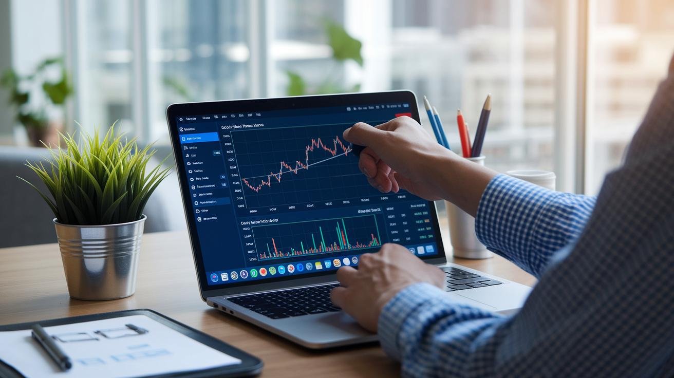
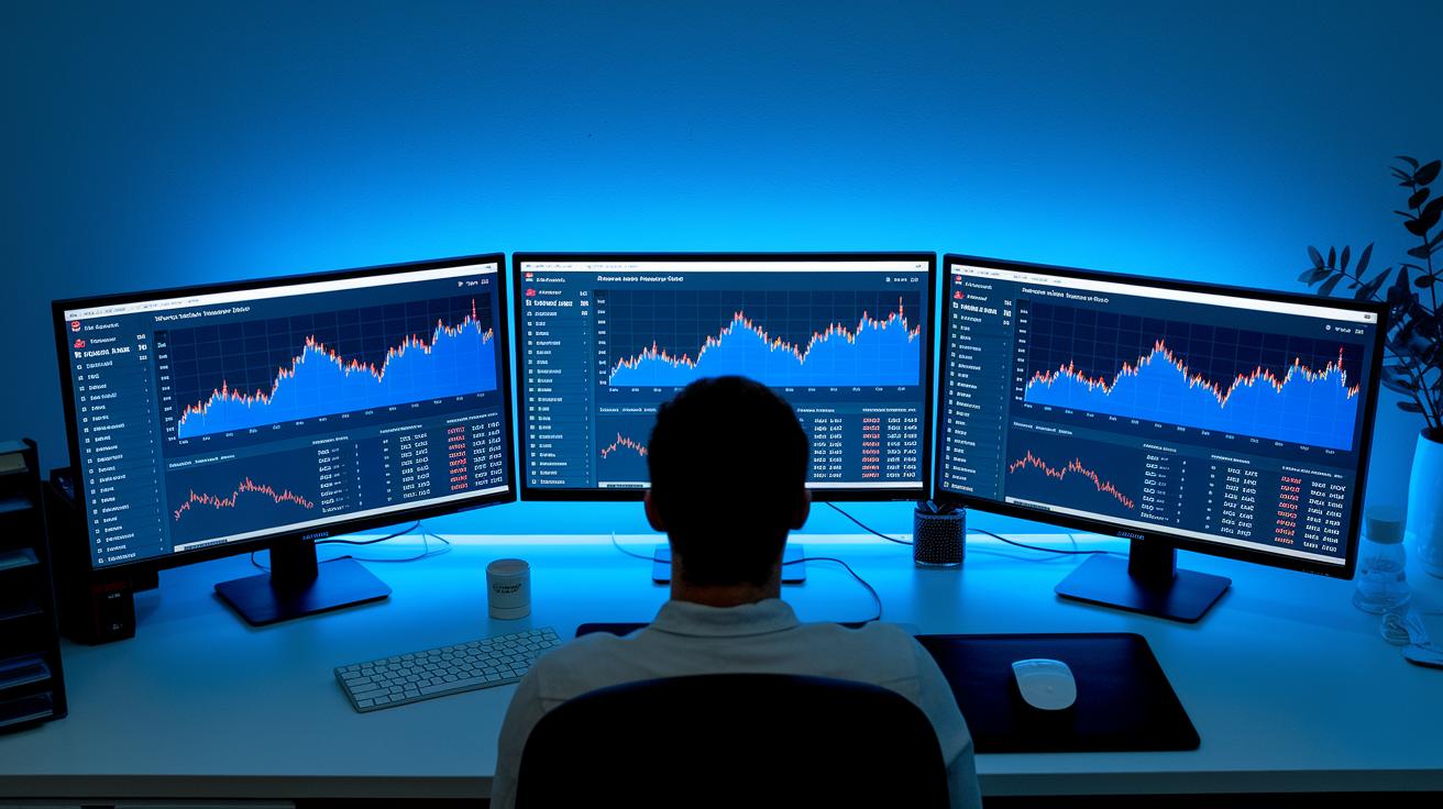
Flexible dashboards are a game changer because they turn a simple snapshot into an interactive tool built for today’s fast pace. When you tweak your dashboard, you’re creating a control panel that not only shows data but also gives you insights you can actually use. It’s like fine-tuning a powerful engine where every gauge has a story to tell, imagine a team leader spotting delays instantly with a custom alert that shifts project priorities right away. This kind of personalization makes it much easier to see which projects need a quick check and helps you make better daily decisions.
A 2024 report revealed that smart portfolio management can lower project costs by around 20 to 30 percent while boosting satisfaction among stakeholders and leaders. Over a quarter of professionals say that when they get a clearer view of their portfolio, it sparks innovation, smooths operations, and even improves employee productivity and customer service, all while speeding up time to market. By letting you choose which details, like cost trends or team output, stay in the spotlight, these dynamic dashboards solve real business challenges without relying on old, generic reports.
When you align these dynamic insights with your own workflow, you’re building a dashboard that truly works for you. With layouts that adapt and visuals that simplify complex numbers, the information becomes much easier to understand. And by picking the key indicators you care about, you set a clear focus on your goals, just like choosing the best ingredients for a balanced meal. Each module you add is a step toward smarter, more effective portfolio management.
Essential Features for Portfolio Tracker Dashboard Customization
Custom dashboards let you zero in on what really counts. When you pick out features like choosing your own widgets or setting up personal analytics, you can see exactly what you need when you need it. And with hands-on customization and flexible panels, your tracker truly fits your way of working. For example, you can highlight key performance indicators (KPIs) that power your team's achievements, and a modular design makes it easy to adjust to your project's flow.
| Feature | Description |
|---|---|
| Progress Monitoring | Keeps track of milestones and timelines so you always know how each task is moving along. |
| Capacity Management | Shows how work is spread across your team to help you use resources wisely. |
| Budget Tracking | Compares what you’re spending to your budget plans to keep your finances in check. |
| Overdue Alerts | Sends notifications when projects run behind schedule, helping you set priorities straight. |
Adding these features makes your dashboard easier to use and gives you a full picture of your portfolio’s health. By highlighting the key details upfront, your dashboard stays in tune with your goals while making tricky financial management tasks much simpler.
Best Practices for Designing Custom Finance Dashboards
A good design is at the heart of an effective finance dashboard. It’s not just about a pretty look, it helps you sift through piles of data with ease. When every piece of the dashboard has its place, you get a tool that feels both steady and reliable for making smart choices.
Using the right colors and a clear layout makes a big difference. Think of it like a roadmap for your eyes. The right color choices point you to what matters most. A tidy setup clears away the clutter, so you can grab key details quickly.
Choosing the right charts makes those raw numbers come alive. Imagine using interactive tools like graphs, tables, Kanban boards, and Gantt charts. They turn data into a story that’s easy to follow. With a personalized design, the dashboard feels like it was made just for you.
And then there’s automation, your trusty sidekick. When routine updates are taken care of automatically, your dashboard stays fresh without constant fiddling. This means you can focus more on understanding the story behind the numbers rather than getting bogged down by endless data updates.
These insights turn dashboards into more than simple displays; they become strategic tools that help fuel smart, data-driven decisions.
Step-by-Step Tutorial for Bespoke Tracker Configuration
Imagine having a tool custom-built just for you, where every detail fits your financial vision perfectly. Building a custom finance dashboard means setting up a system that works exactly the way you need it to, complete with tailored data feeds and interactive modules that adjust to your daily workflow.
First, start by figuring out your goals and what you want to achieve. Think of it like drawing a map that guides every decision. Have you ever felt the excitement of knowing exactly where you're heading? Once your objectives are clear, move on to the next step.
Next, bring together your favorite tools and data sources into one seamless interface. By combining these pieces, your dashboard can speak the same language as your overall strategy. It’s like mixing ingredients to create a balanced meal, each element supports the others for the best outcome.
Then, launch your dashboard and watch it come to life! This is where your creation starts working for you. But don’t stop there. Keep an eye on how the dashboard handles real-world data and listen to feedback. For instance, if you notice a data feed updating too slowly, tweak the settings. Maybe those interactive modules need a little rearranging to be even clearer. Remember, small adjustments over time can turn a regular dashboard into a dynamic control panel that grows with your needs.
In truth, building this tracker is all about blending strategy with technology. By continuously refining your setup, you'll transform raw data into useful insights, empowering you to make smart, confident financial decisions every day.
Advanced Styling and Code Examples for Custom Dashboard Tweaks
Boost your portfolio tracker dashboards with cool, custom graphics and personal chart modules. With these tweaks, you can add new features without overhauling your whole system. Imagine having a smart chart that pulls live data, it’s like giving your dashboard an extra set of eyes to watch over your key numbers.
JavaScript Widget Integration
Let’s chat about adding JavaScript widgets. They let you sprinkle in dynamic filters and switchable data series that make your charts come alive. Picture a widget that listens for fresh data and updates your chart in real time. Here’s a handy snippet to get you started:
<script>
  // Create a custom chart widget
  function loadCustomChart(dataUrl) {
    fetch(dataUrl)
      .then(response => response.json())
      .then(data => {
        // Initialize chart using library like Chart.js
        const ctx = document.getElementById('customChart').getContext('2d');
        new Chart(ctx, {
          type: 'line',
          data: {
            labels: data.labels,
            datasets: [{
              label: 'Live Data',
              data: data.values,
              borderColor: '#007bff',
              fill: false
            }]
          },
          options: {
            responsive: true,
            dynamicFilters: true
          }
        });
      });
  }
  loadCustomChart('/live-data-endpoint');
</script>
CSS Theme Variables
You can also give your dashboard a fresh look with CSS variables. This lets you easily change color themes and tweak your layout to fit any screen size. Think of it as setting the mood with the right colors and fonts, whether you’re on a phone or a big monitor. Check out this example that sets up your basic color scheme and font size:
:root {
  --primary-color: #007bff;
  --background-color: #f8f9fa;
  --font-size: 16px;
}

body {
  background-color: var(--background-color);
  color: var(--primary-color);
  font-size: var(--font-size);
  margin: 0;
  padding: 20px;
}

@media only screen and (max-width: 600px) {
  :root {
    --font-size: 14px;
  }
}
Test these styles on different devices to be sure your dashboard looks smooth and works well everywhere.
Tools and Platforms for Custom Finance Dashboard Creation

When you're checking out different platforms, you might notice that solutions like Tempo’s Portfolio Collection and Jira Custom Charts really shine with their features. They offer flexible tools with solid reporting, drag-and-drop parts you can easily move around, and data updates as they happen. They work well with visual collaboration systems, so whether you run a small team or a big enterprise, they fit right in. Plus, their pricing grows with you, letting you add new features along the way. Imagine a dashboard that you can tweak on the fly without overhauling the whole system.
Choosing the right platform means digging a little deeper than just the basics. You need a tool that lets you customize your dashboard down to every little detail and adapt the layout to match your style. Check how smoothly it plays with your current systems and if it offers custom ways for integration that suit your reporting needs. Look for options that let you adjust everything, focusing on the strategic indicators you care about most. And if you need more guidance, consider checking out the insights on Tools for Market Analysis to find the best match for your unique setup.
Troubleshooting Modular Tracker Design and Performance Optimization
Modular tracker dashboards can run into problems like slow widget loading and spotty data syncing. These issues often come from handling too much data or using old integration methods. When your dashboard can’t keep up with live updates, its readings might be off, which can slow down important decisions.
For technical improvements, try tuning your API queries and adding stronger caching layers. Instead of sending one large batch of data, break your requests into smaller, more frequent updates. For instance, you might split your requests and set cache expiry times that match your dashboard’s refresh rate. These tweaks help keep your tracker quick and responsive, so you always get accurate, real-time insights.
To keep things running smoothly, make it a habit to check key performance indicators like widget load times and error rates. Using a dashboard that shows these metrics can give you clear insight into your system’s health. By keeping an eye on the data and making regular adjustments, you ensure your modular tracker stays agile and turns live data into actionable advice.
Final Words
In the action, you’ve explored how to fine-tune your dashboard, choosing key features and utilizing hands-on techniques to boost portfolio clarity. The guide walked through practical insights, from adaptive layout design to testing your tweaks for better decision-making. Each section offered clear steps toward a flexible setup, ensuring your investments stay informed and secure. By customizing portfolio tracker dashboards, you’re setting the stage for smarter moves and smoother operations. Keep refining your strategies and enjoy the steady confidence that comes with a well-crafted dashboard.
FAQ
How can I use free portfolio tracker dashboard customization options?
Using free portfolio dashboard tools means setting up your dashboard at no cost. These options let you adjust charts, tables, and key figures so your data fits your everyday needs.
How do I customize portfolio tracker dashboards using Excel and PDF templates?
Customizing dashboards in Excel and PDF lets you work with familiar software. You can use built-in features, formulas, and pre-made formats to quickly set up and modify your financial displays.
What are some of the best portfolio dashboard examples?
The best portfolio dashboard examples combine a clear layout, interactive visuals, and focused key performance numbers. They demonstrate how tailored data displays can make financial tracking both insightful and simple.
How do platforms like Power BI, Yahoo! Finance, Google Finance, and others compare?
These platforms each offer unique dashboard features. Power BI provides interactive visuals, while Yahoo! Finance and Google Finance focus on real-time market data. Investing.com, TradingView, Seeking Alpha, and MarketWatch deliver varied insights to suit different tracking styles.